Evoke meaning and emotion
Choosing colour for a brand identity is far more involved than just finding a pleasing palette. Colour has the ability to evoke strong emotions and meaning. Bright colours can invigorate, while muted ones are calming. Fonts and their varied shapes and thicknesses reflect personality in much the same way.
York Colours
Our colour palette reflects our positive emotional and psychological stance, and colour helps our stakeholders and prospects recognize the York U brand in the marketplace. Learn more below on how to effectively use our colour palettes.
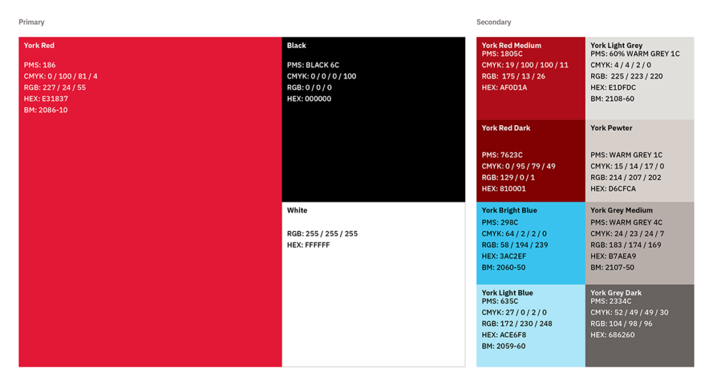
Our primary brand colour, York Red, should be the most prominent colour on all communication pieces. It is complemented with accent blue, dark red and warm grey colours. All the colours work together seamlessly, but the accent colours are always used to support and be in the service of our York Red, never in competition with it.
Some colours in the York palette have approved Benjamin Moore (BM) paint swatches.
Download York U's Adobe Swatch Exchange file here. Anyone working within Adobe products will benefit.
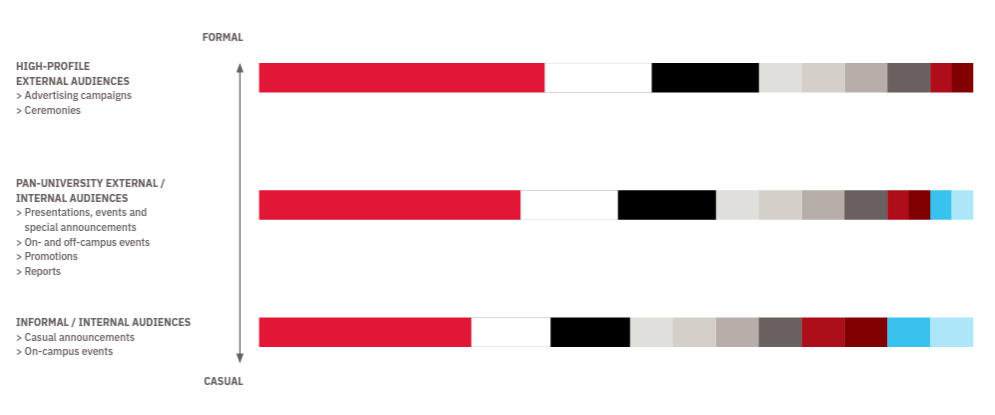
The individual colours in the brand palette may be used in different ratios. Think about your audience and choose the right proportion of colour for the type of message you wish to convey. The scale below will help you determine how to use the colours to create communications that range from the formal to informal.
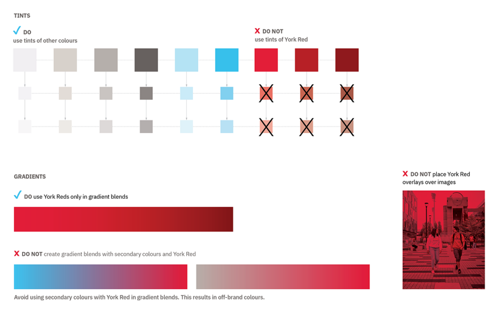
Gradients and tints of York’s colour palette should be used in moderation, complementing the piece and assisting in the legibility of text.
Tints: are created by adding white to any hue, lightening and desaturating it to create a subtler and lighter colour. Applying a tint or revising the colour in any way is NOT permitted for York Red.
Gradient: A gradient is the gradual blending from one color to another, enabling the designer to almost create a new color.
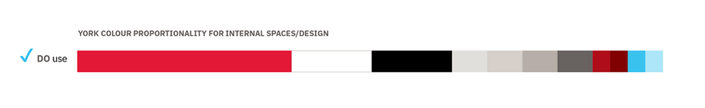
Colour helps our stakeholders, the community and prospective students recognize the York brand in the marketplace. It is vital that brand colours be represented within the physical spaces allowing for an immersive and cohesive experience and creating memorable brand recognition.
York Colours: Our primary colour palette has longevity and should be used in permanent/feature areas.
Faculty “Accent Colours”: Must be used in moderation as these may not have longevity due to branding changes over time. Signage such as name plates or other directional signage are not permitted to use Faculty accent colours.

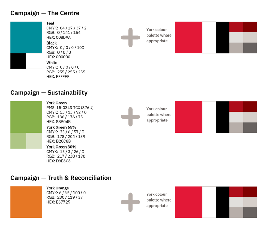
The York palette will play a secondary role when there is a designated national or international campaign associated with a specific colour. Communications will still need to incorporate the York palette to align with the University where appropriate. Please ensure you connect with experts in the area and liaise with University Brand & Marketing in these instances: cpabrandmar@yorku.ca.
Colour Modes CMYK
Use this mode when working on projects that will be printed. The acronym represents the four colours used in a printing press (cyan, magenta, yellow and black)
Gradient Hex Code
A smooth transition from one colour to another - black to white, red to yellow and all the colours in between.
Greyscale
Use this mode when working on black-and- white print projects. Any colours in your file should be converted to a shade of grey.
Hex Code
Used for web projects. HEX codes are six-digit codes that represent a certain colour.
PMS (Pantone® Matching System)
Used for print projects where colours must be matched exactly. The acronym represents the Pantone® Matching System, which is a system of specially mixed inks that must match a certain, standardized colour (ex. York Red is PMS 186).
Specialty colours, such as metallic or fluorescent colours, are also available. Pantone Coated: PMS “C” used for printing spot colors on glossy paper or novelty items (such as firm pocket folders, or pens, water bottles etc.). Pantone Uncoated: PMS “U” used for printing spot colors on uncoated paper (such as business cards and stationery)
RGB
Used for anything viewed on monitors, such as web, video or other on-screen projects (LCD screens). The acronym represents the three colours of light displayed on screens (red, green and blue).
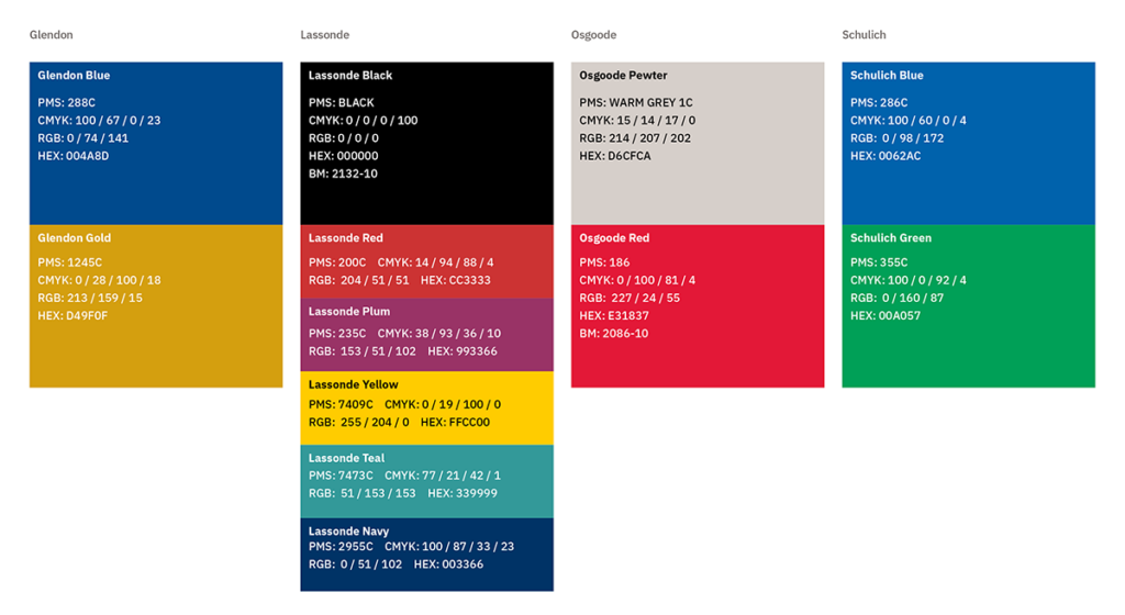
Sub-brand Colours
Glendon, Lassonde, Osgoode and Schulich have long-established colour palettes that are strongly associated with their identities. More information about how to utilize these palettes can be found on your Faculty Assets page.
The usage of these sub-brand colours is reserved for sub-brands only and has standards around proportionality.
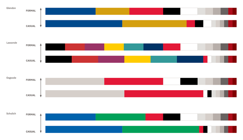
The palette proportionality provides guidance on how much of the York Red to include in your communications alongside the sub-brand palettes. For internal audiences, sub-brands may use their primary colours more liberally. But for pan-university and external-facing communications, the York Red must be evident for alignment.
Faculty Colours
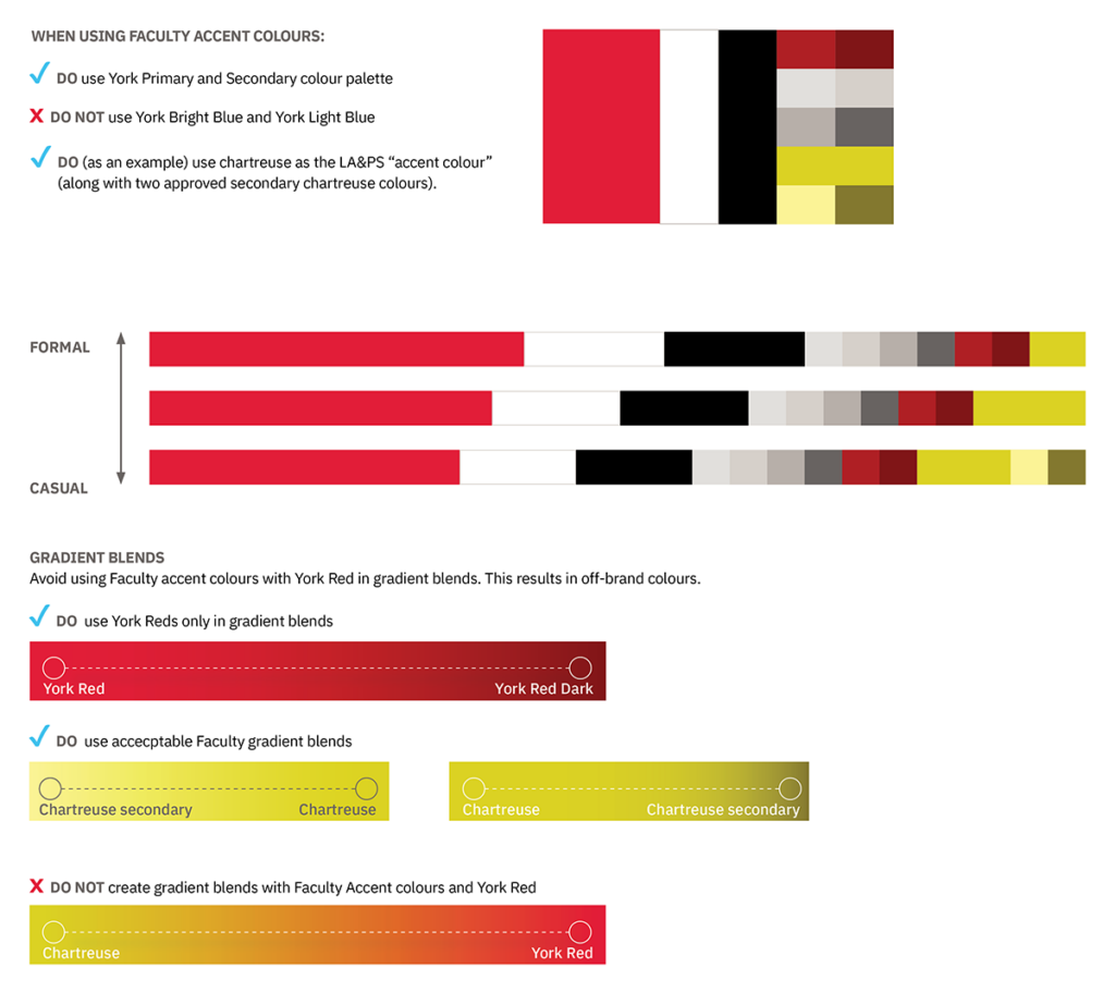
A secondary accent palette representing York’s individual Faculties provides the opportunity for greater expression and consistency within the York brand. Inspired by our campuses, each colour has been chosen for the way it works in harmony with York Red and its connection to the message of positive change that the University exudes.
The usage of these Faculty accent colours is reserved for Faculty only and has standards around proportionality.

Each Faculty is differentiated from the master brand by a specific accent colour. The proportionality scale below guides you on how to use these based on the intended audience (from formal to informal).
Greys and dark reds from the primary palette may be used to supplement these accent colours, as well as tints and gradients in moderation.
Each Faculty has a main accent colour and two additional shades (for use only in limited proportionality when needed for AODA or long-form purposes).
The palette acknowledges those with visual impairment and, as such, adheres to accepted accessibility standards set out in the Accessibility for Ontarians with Disabilities Act (AODA).