Why is the logo important?
As an international teaching and research university, the York University logo is recognized around the world. Throughout all touch points, our logo represents our brand and signals our collective desire to create positive change.
York logos are available to all academic and administrative units. According to our brand stewardship policy permission is required by all alumni, students, and outside organizations to use the logo. Usage of York logos have guidelines that must be followed to protect the brand identity. See below for all of the rules surrounding the usage of the York logo and its variations.
York Logos
As a leading university York University has a logo that is recognized around the world. Throughout all our touch points, our logo represents our brand and signals our collective desire to create positive change.
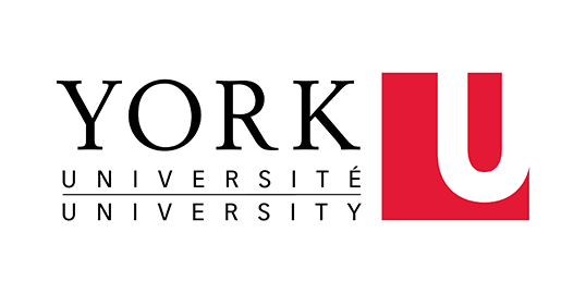
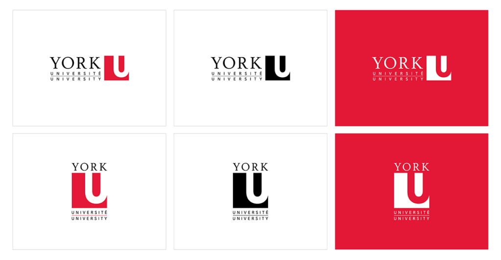
The York logo is composed of two parts: the typographic signature and the York U square. They must always be used together and should not be altered in any way.
Primary Logo
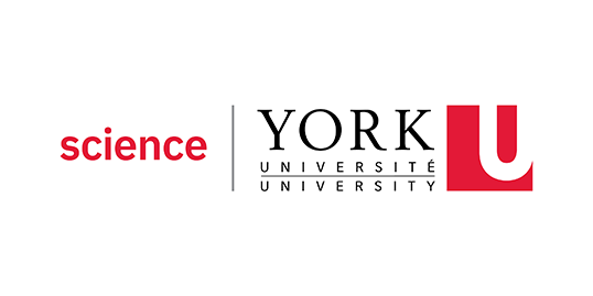
The primary logo is composed of two parts: the typographic signature and the York U square.
They must always be used together and should not be altered in any way. This is for print and large-scale pieces. The logo must be produced at a legible size.
NOTE: always use this version of the logo for International representation or sponsorship purposes.
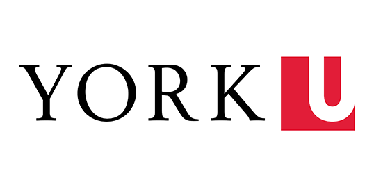
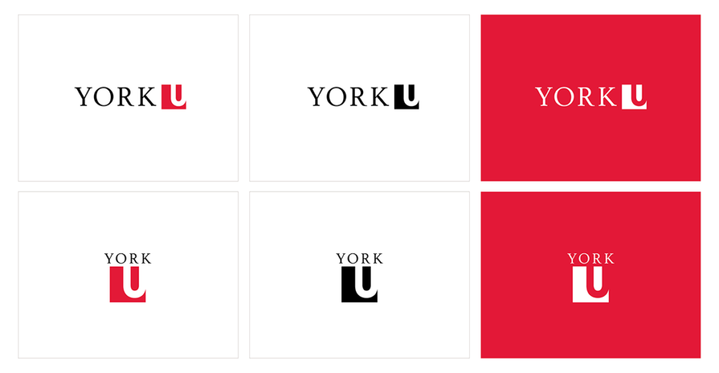
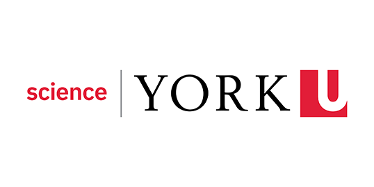
Digital Logo
A simplified variation of our primary logo and designed to ensure optimum legibility and reproduction in digital media. This version should be used for any media where it will be rendered in pixels. This may also be used in small spaces where legibility is a concern.
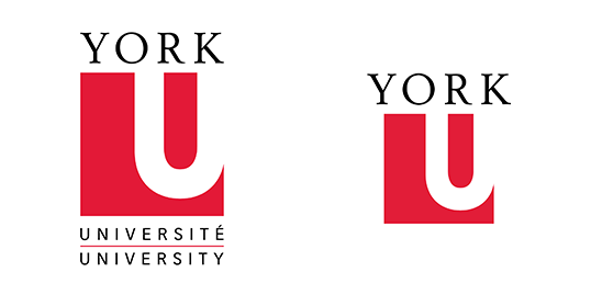
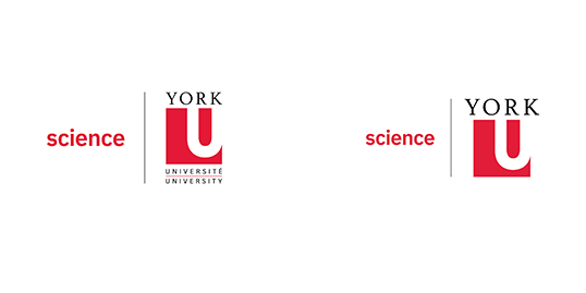
Vertical version alternate (primary and digital)
To be used only when there is not adequate space for the horizontal logo.

Digital favicon logo
The digital favicon logo is limited use only and requires approval. It is used primarily for website tabs/bookmarks or as a decorative/functional component to interior campus spaces.
The York U crest is the most formal expression of our brand and should only be used in official, scholarly and ceremonial applications. Please contact University Brand & Marketing if you wish to use the crest: cpabrandmar@yorku.ca.

For consistency across all communications, the preferred placement for the York U logo is the bottom-right corner. This rule applies to the primary, sub-brand and Faculty logos. The sub-brand and Faculty lock-ups are designed with a flush-right typographic setting to always work better on the right-hand side of your design. In instances where it is illegible on a photograph or background, or to create a more pleasing layout, the York U logo may be placed in one of the other corners of your document or media file. For example, the logo works better in the top left for e-communications. The logo should never be centred in your design. Please note these are not the full rules regarding logo placement. See section Window of Positive Change.
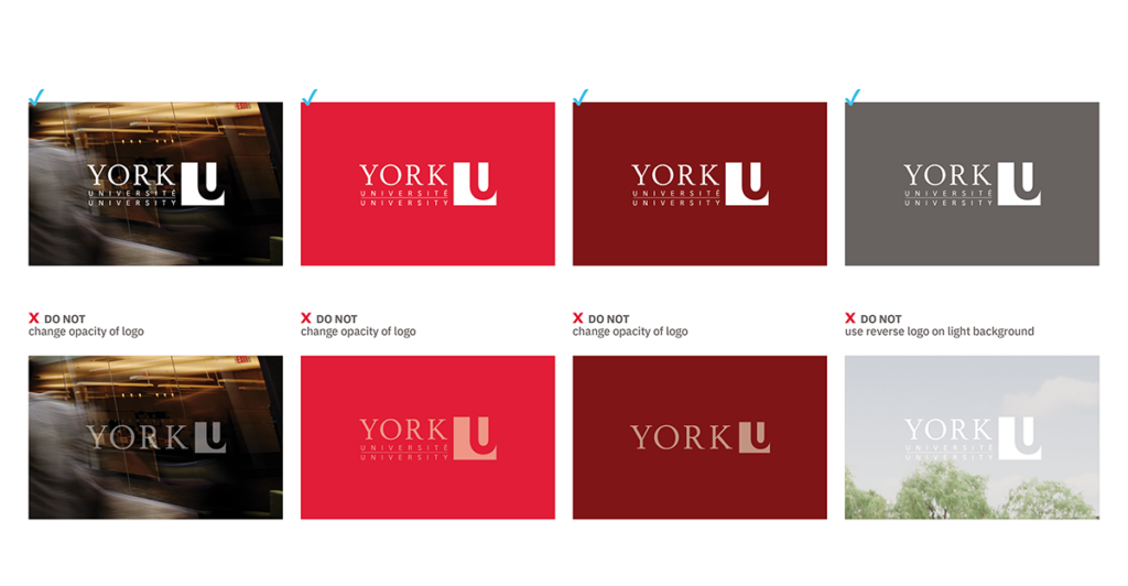
A reverse version of our logo has been created, to make it easier to use in a variety of applications.
For example, it can be used on a solid York Red background or full-colour photograph where it will be clearly legible.
Our York Red (PMS 186; Hex E31837) plays a critical part in helping our stakeholders, peers and prospects recognize the brand in the marketplace.
A digital version of the logo has been created to maximize legibility on screens and in media where the logo will be rendered in pixels. To maintain the strength and clarity of the logo, choose the option most appropriate for the corresponding background colour or image.
The reverse logo should only be used on solid backgrounds or on photographs where it will be clearly legible.
The full colour logo may be used on white backgrounds, light-coloured backgrounds and the full colour logo may be used on white backgrounds, light-coloured backgrounds and photographs with clean space where it will be clearly legible. Do not change the opacity of the logo or use on dark or "busy" imagery.
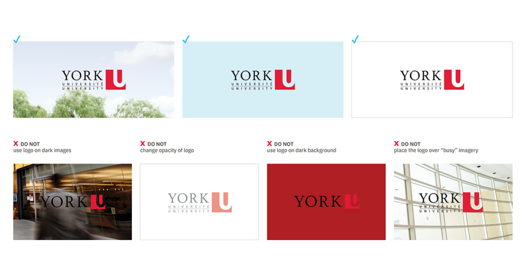
The reverse logo may be used on photographs where it will be clearly legible. It may also be used on certain solid backgrounds, like York Red and the darker hues of our primary and secondary palettes. It may be knocked out of Faculty accent colours only if legible. Remember, the logo must have enough contrast between the foreground and background to comply with Accessibility for Ontarians with Disabilities Act (AODA) standards.
For AODA guidelines, please refer to the Accessibility Hub at https://www.yorku.ca/accessibilityhub/.
Do not change the opacity of the logo or use on dark or "busy" imagery.
Using the logo correctly supports brand recognition, and maintains its legibility and impact.
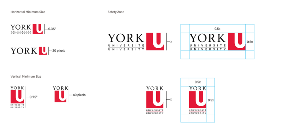
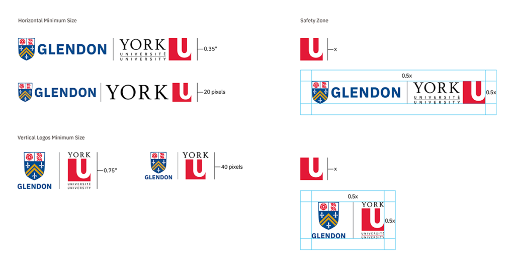
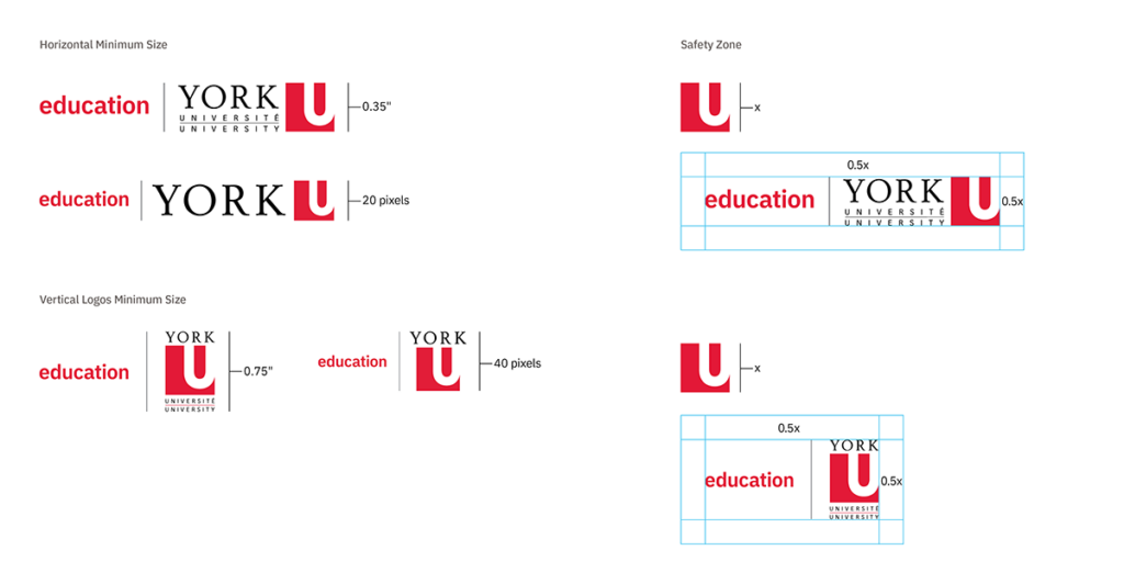
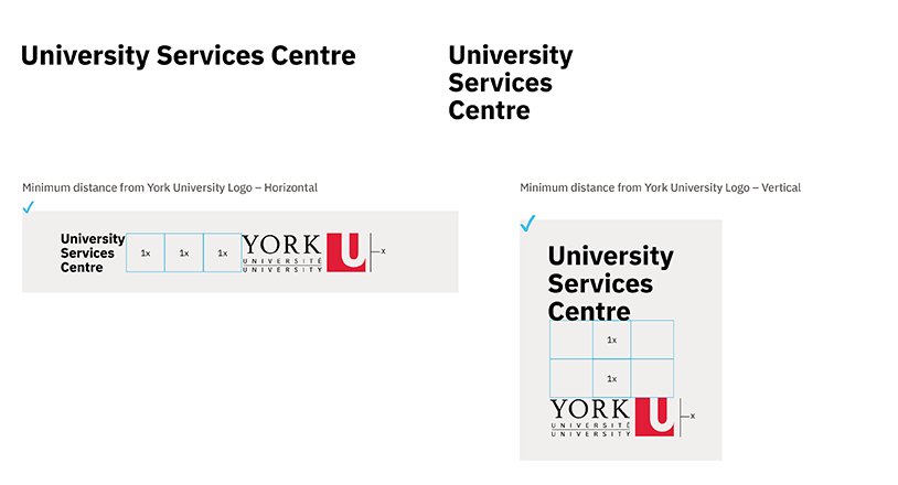
The logo is protected by an invisible safety zone where no graphic material – other than the background – should appear. This ensures the logo remains free from visual interference and stands out clearly.
The safety space is defined by “X”, which is the height of the York U square.
See the visuals for minimum size and safety space standards.
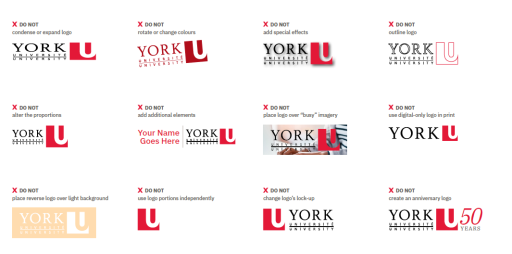
The logo is the most important asset of our brand.
While the brand provides many opportunities for creative expression, the logo must not be altered in any way.
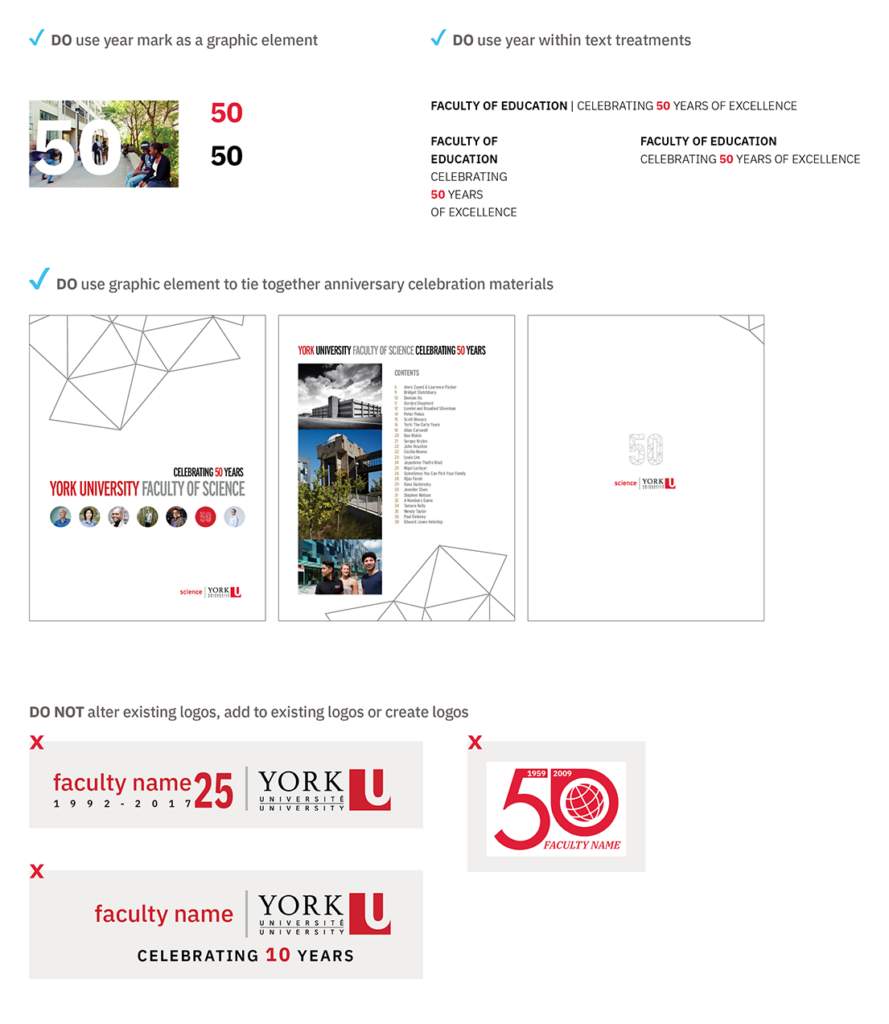
Please do not create any special event or anniversary versions of the logo. Contact University Brand & Marketing if you have any questions or special requests: cpabrandmar@yorku.ca.
Athletics & Recreation Mark
All York Lions are a source of University pride championing physical activity, sport & wellness. We all have the #HeartOfALion!

Spirit Mark
The York U heart represents the emotional connection that our engaged students have with the university and how the university also prioritizes student success and well being. For more information please contact Mike Kasaboski.
Logo
Text combined with a graphic mark, emblem or symbol used to aid and promote public identification and brand recognition. For example, the York University logo.
Locked Logo
A combination of a primary logo with a text treatment or other logo. For example, a Faculty name or sub-brand logo next to York logo with divided grey line.
Logomark / Brandmark
A logo mark generally does not contain the name of the company and instead more abstractly represents it using a symbol or mark (e.g. apple icon used by Apple). Brandmarks are commonly accompanied by a logotype, but not always. For example, the York Lions mark.
Text Treatment
Text typed in the primary font to define a division, campus or initiative- and never in close proximity to graphic, emblem, icon or York logo.
Design Treatment
A graphic or type treatment using complimentary pictorial mark(s), typography or photography that follows brand guidelines (i.e. colour, font, photography style).
Emblem
An object or picture used to suggest a concept or an idea. A suite of unique emblems has been developed for use by the York community.
Icon
A series of pictorial images relating to or illustrating a variety of content or messages. They are designed to rapidly convey intention in a variety of mediums including social media, websites, print publications and more.
Tagline
A short, easily recognizable phrase used in advertisements, especially on television or online.
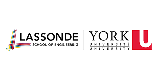
Sub-brand Logos
At York, we are proud of our affiliated schools and our bilingual Glendon campus for their excellence and contributions to the University’s reputation.
The typographic (font) lock-up system was designed to promote the sub-brands first, while retaining the connection to the York master brand. Do not split up these locked logos, as this dilutes our overall messaging. We are stronger together.
Primary Logos
These locked-up versions are for use in print applications.
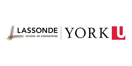
Digital Logos
These locked-up versions are for use in digital applications like social media, PowerPoint presentations, digital ads or whenever the logo is rendered in pixels.
The reverse version of the logo may be used on a photograph or solid background, but only if clearly legible.
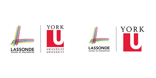
Sub-brand Vertical Version - Alternate
The vertical version of the logo is considered a secondary use and is to be used only when there is not adequate space for the horizontal logo.
Using the logo correctly supports brand recognition, and maintains its legibility and impact.
The logo is protected by an invisible safety zone where no graphic material – other than the background – should appear. This ensures the logo remains free from visual interference and stands out clearly.
The safety space is defined by “X”, which is the height of the York U square.
Faculty Logo
Like our sub-brands, the Faculties take a prominent position adjacent to York’s master brand. These locked-up versions are
for use in print applications in either full colour, black-and-white or reverse.
Primary Logos
Like our sub-brands, the Faculties take a prominent position adjacent to York’s master brand. These locked-up versions are for use in print applications in either full colour, black and white or reverse.
Digital Logos
These locked-up versions are for use in digital applications like social media, PowerPoint presentations, digital ads or whenever the logo will be rendered in pixels.
Sub-brand Vertical Version - Alternate
The vertical version of the logo is considered a secondary use and is to be used only when there is not adequate space for the horizontal logo. (i.e. narrow web ads or small merchandise such as tennis or golf balls, pens, notebooks, apparel etc.)
Using the logo correctly supports brand recognition, and maintains its legibility and impact.
The logo is protected by an invisible safety zone where no graphic material – other than the background – should appear. This ensures the logo remains free from visual interference and stands out clearly.
The safety space is defined by “X”, which is the height of the York U square.
Division/Unit/Initiative Expressions
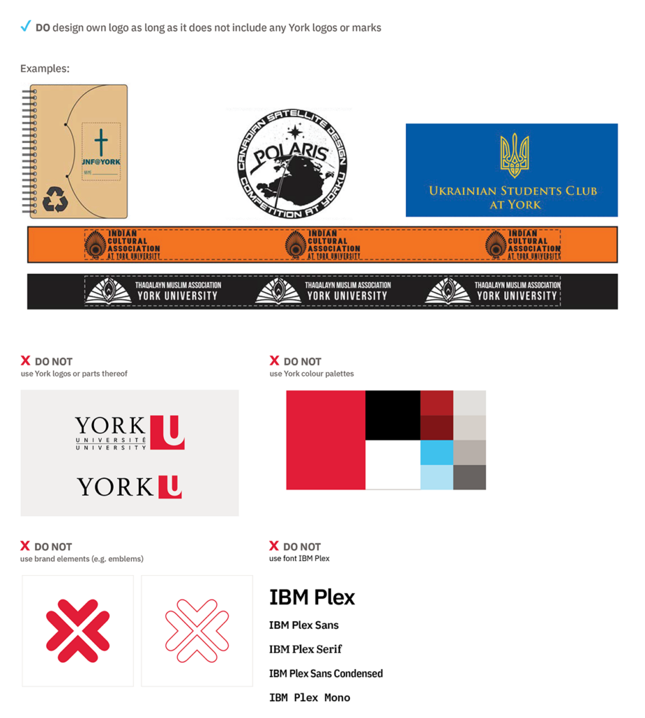
Division, unit, campus, initiative and student initiatives can be expressed through the use of text treatments and other design elements. Our divisions, units, campuses and university initiatives all benefit from a consistent brand expression. Here are some simple rules to guide you as you develop your materials and include text treatments. The creation of logos is NOT permitted.
- Use the primary IBM Plex Sans - font in the body of the creative space away from the York logo and any other design elements.
- Use the primary colour palette of all black, all white or all red.
- Use title case for best legibility/AODA compliance and avoid the use of acronyms.
York’s master-brand architecture establishes that the names of divisions, units and initiatives are not attached or locked to the York logo.
Unique logos for divisions, units or initiatives are not permitted as they proliferate the brand.
The University’s official primary font (IBM Plex Sans) must be used to represent your division, unit or initiative within the creative space and away from the York logo.
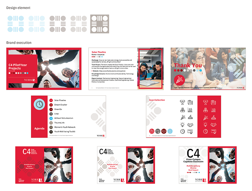
Design Treatment (i.e. graphic elements or emblems) and relevant photography can be used within your creative space, but cannot be attached to the name of the initiative.
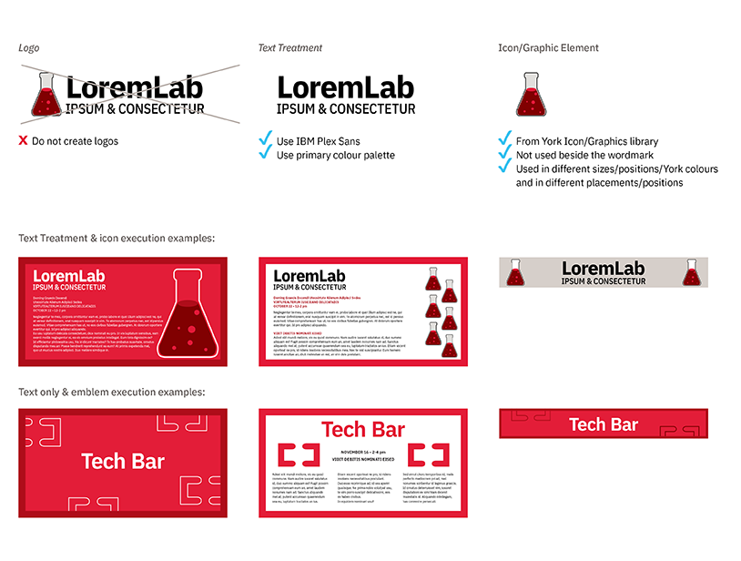
A design treatment refers to a graphic or type treatment using complimentary pictorial mark(s), typography or photography that follows York’s brand guidelines (i.e. colour, font, photography style). The treatments are either single use or multi-use, must be fluid and adapt for different applications and may not become more distinct then the York logo.
Design treatments are used for defining campaigns, Faculties and events. The overarching brand must still be prominent, and no treatment should appear as if it is a logo.
It is not permitted to lock a logo with a text treatment.
If you need assistance or approval on a text or design treatment, please contact University Brand & Marketing: cpabrandmar@yorku.ca.
If you would like to celebrate an occasion within your sub-brand/Faculty you can do so using design and/or text treatments as shown in the examples at right. Anniversary and celebratory logos are NOT permitted.
You can use the anniversary milestone statement for a limited time in your email signature and in the body of the creative space of your communications. Always use the primary font, and primary colour palette.
Clubs, organizations and student-run initiatives are not permitted to use any element of the York brand (such as the fonts, colours, logos or design system), as they are not officially sanctioned University properties.
The only exceptions are: if the initiative is partnership approved, sanctioned via contract or sanctioned by your Executive Lead. Please check with your Executive Lead. If this does fall under one of the three exceptions outlined above, please contact cpabrandmar@yorku.ca
Partnership/Sponsorship Expressions
York’s many Faculties, divisions and units may partner with external companies or purchase sponsorship packages. Outlined below are examples of how to ensure brand compliance.
York’s many Faculties, divisions and units may partner with external companies and institutions on a regular basis. The following are items to consider when engaging in these partnerships.
The York primary logo should be used unless illegible (i.e. will not meet AODA).
Using the York Logo:
When an official partnership with an external company, institution or organization that includes a signed contract/agreement sanctioned by your Executive Lead:
- A line cannot be placed between the York logo and partner logo
- Minimum space is required between the York logo and partner logo is double the York U square (i.e. X) in a horizontal lock-up.
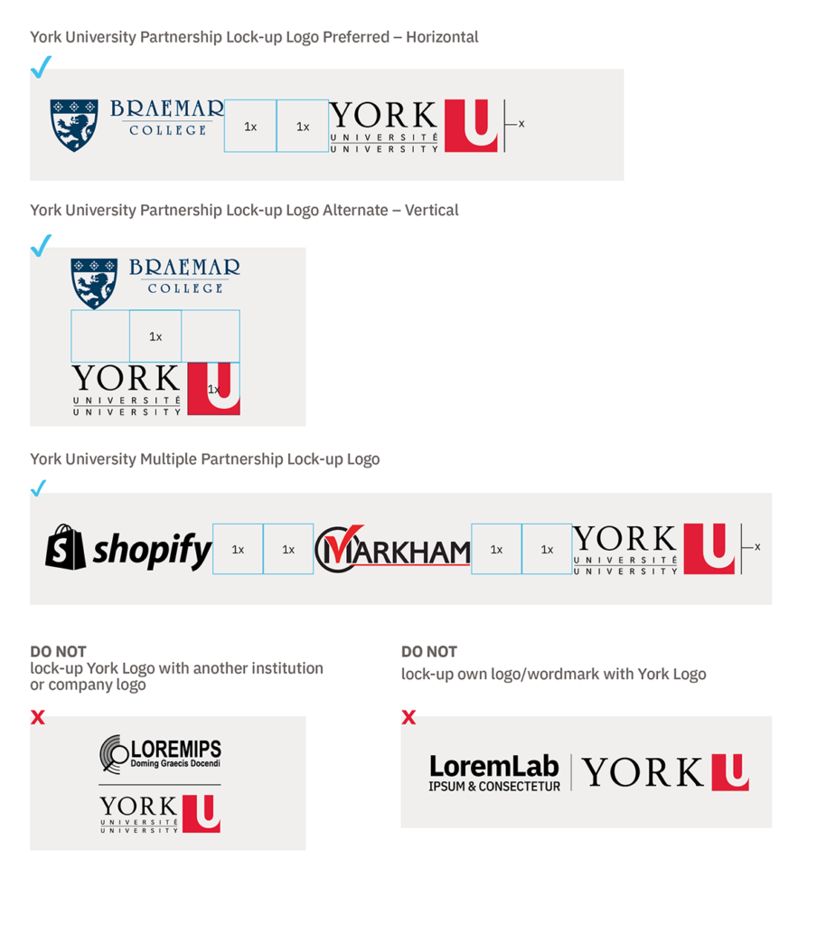
External Sponsorship:
The York primary logo should be used unless illegible (i.e. will not meet AODA).
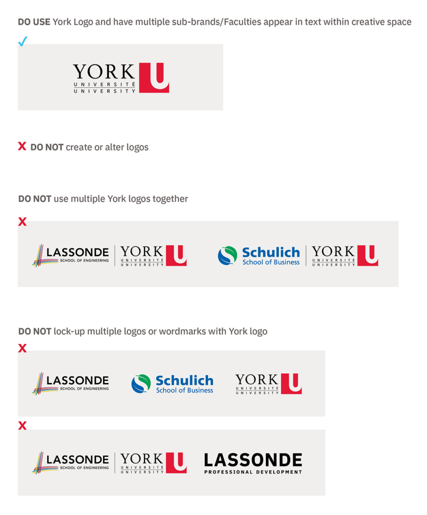
Multiple Sub-brand/Faculty Representation:
To represent a professional image, only one Faculty or sub-brand logo can be locked to the primary York logo. When the Faculty/sub-brands have multiple sponsors within the University, use the primary horizontal York logo and these areas can be referenced through text within the creative space.
Internal/On-Campus Sponsorship:
Use your locked logo if you have one. If you are a division, unit or initiative and do not have a locked logo, use the primary horizontal or digital York logo only – your division or unit will appear as text only in the creative space.